How we determine
audience thresholds.
Every AMAP audience segment goes through a rigorous, data-driven process to determine which geographic areas are truly over-indexing for a given behavior. Here's the methodology behind the math.
Not all concentration
is meaningful.
When we analyze an audience — say, "Luxury Auto Intenders" — we see varying levels of concentration across thousands of postal codes. The question isn't where they exist. It's where they over-index enough to matter.
Set the threshold too high: you get hyper-relevant but tiny reach. Too low: you dilute the signal with noise. The optimal threshold lives at the inflection point — and finding it is both science and craft.
Example
Too strict (99th percentile)
~50 postal codes, 200K reach. Hyper-relevant but campaigns can't scale.
Too loose (50th percentile)
~2,500 postal codes, 35M reach. Audience looks like general population.
Optimal (dynamic, ~80th)
~1,000 postal codes, 10-15M reach. Maximum signal with actionable scale.
Threshold in action.
The same audience — Household Income $200K+ — viewed at three different threshold levels. Watch how the highlighted areas shrink as the threshold tightens, isolating only the highest-concentration zones.
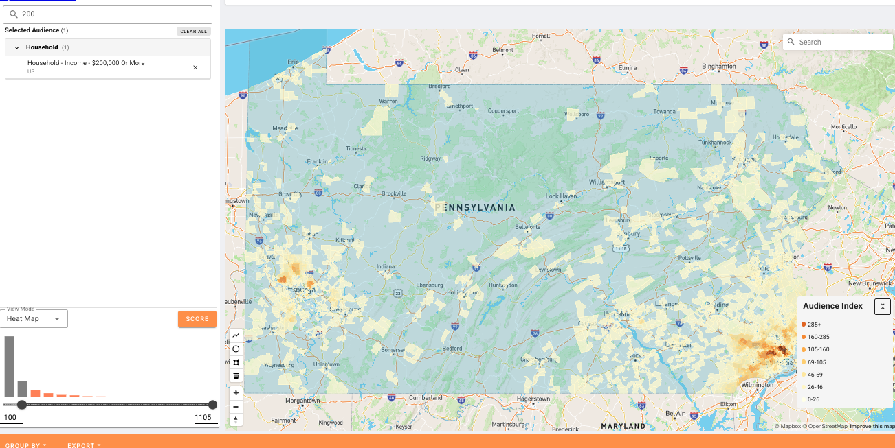
Threshold: 100
Low threshold — most areas qualify. Broad reach but less audience differentiation.
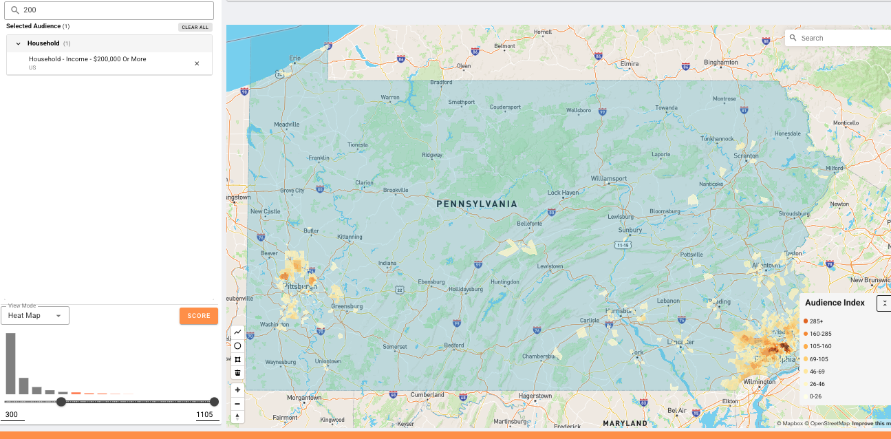
Threshold: 300
Mid-range threshold — starts to reveal geographic clustering. More signal, narrower footprint.
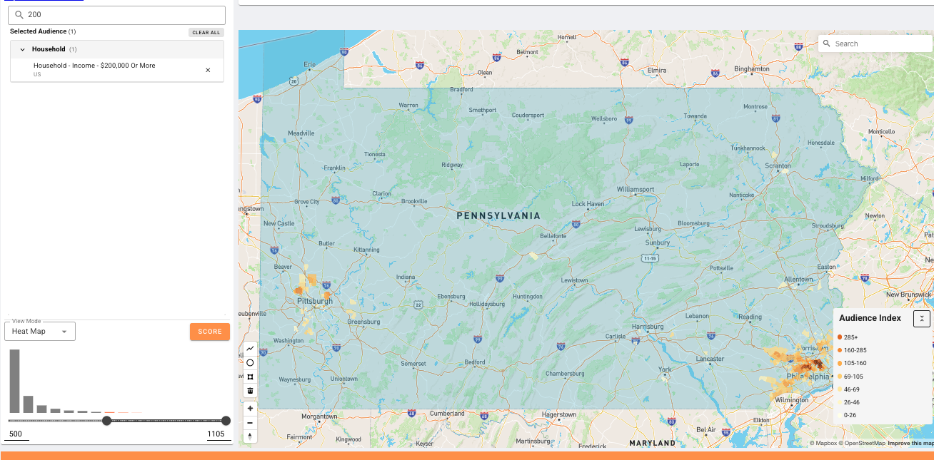
Threshold: 500
Higher threshold — fewer areas pass, showing where concentration is strongest. The right level depends on campaign goals.
Four analyses. One
optimal threshold.
Distribution Analysis
We analyze the concentration score distribution across all postal codes. This reveals the shape of the audience — is it tightly concentrated in a few areas, or broadly spread?
Key metrics examined:
50th %ile
Median concentration
80th %ile
High-value cutoff
95th %ile
Ultra-concentrated
Std Dev
Spread of signal
A histogram of scores reveals whether the distribution is right-skewed (most areas have low concentration, few have high) — which is the typical pattern for well-defined audiences.
Cumulative Population Curves
We sort all postal codes from highest to lowest audience concentration, then plot the cumulative population. This S-curve reveals the critical inflection point.
What we're looking for:
- The "elbow" where the curve flattens — adding more postal codes yields diminishing audience gains
- The 45-degree angle test: once cumulative growth drops below linear, you've hit diminishing returns
- The derivative (rate of change) bottoming out confirms the optimal cutoff point
Reach vs. Relevance Balancing
The core optimization: find the threshold that maximizes the ratio of audience relevance to population reach. This is a segment-specific calculation — no universal cutoff works.
Balance metrics:
Ex: Targeting ~10% of the population while capturing areas with 4.7x average concentration — that's the kind of efficiency ratio we optimize for.
Iterative Validation
This isn't a one-shot calculation. Each audience segment undergoes iterative tuning where we adjust the percentile threshold and evaluate the downstream impact.
Validation checks:
- Does the segment differentiate meaningfully from general population?
- Is the reach sufficient for campaign activation across CTV, display, audio, and DOOH?
- Does the cumulative difference curve between total population and audience population confirm the cutoff?
- Stability test: does the threshold hold across multiple data refreshes?
Seven views.
One decision.
For each audience segment, we generate a diagnostic panel of seven charts. Together, they tell the complete story of where to draw the line.
Population Per Postal Code
Sorted from highest to lowest concentration. Shows the raw population in each postal code — context for understanding what each area represents in absolute terms.
Concentration Score (Decay Curve)
The audience concentration score across postal codes, sorted high-to-low. This exponential decay curve shows how quickly relevance drops off. The steeper the initial drop, the more concentrated the audience.
Audience Population Per Postal Code
The actual audience population (not score) per postal code. This separates signal from noise — high concentration in a tiny postal code matters less than moderate concentration in a dense one.
Cumulative Audience Population
The S-curve. We watch for the inflection point where adding more postal codes provides diminishing audience gains. The vertical dashed line marks the current percentile threshold — ideally placed where the curve transitions from steep to flat.
Derivative (Rate of Change)
The first derivative of the cumulative curve. When this bottoms out and flattens, you've found the point of diminishing returns. This is the mathematical confirmation of the visual inflection point.
Cumulative Total Population
Context chart: how much of the general population you're covering at each threshold. Important for ensuring the segment reaches enough people for campaign activation.
Cumulative Difference Score
The ratio between audience and total population cumulative sums. When this starts bottoming out, your audience has lost its differentiation from the general population — a clear signal to stop expanding.
Guiding principles.
No universal threshold
Every audience segment has a different optimal percentile. "Luxury Auto Intenders" might threshold at the 85th percentile while "Fast Food Enthusiasts" might work at the 70th. The data dictates the cutoff, not a fixed rule.
Concentration ≠ population
A postal code with 90% concentration but 500 people matters less than one with 40% concentration and 100,000 people. We weight both factors in our threshold decisions.
Diminishing returns are real
The cumulative population curve always flattens. Once the derivative approaches zero, every additional postal code adds noise, not signal. We stop before that point.
Activation-ready by design
Thresholds are set with media activation in mind. A segment needs enough postal codes to run a meaningful campaign across CTV, display, DOOH, audio, and social — typically 500+ postal codes with 5M+ population reach.